Background information
Name to incorporate in the logo
Steady Shot
Slogan to incorporate in the logo
"Let's Rotate" - include a version with the slogan and without please
Description of the organization and its target audience
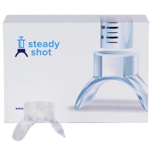
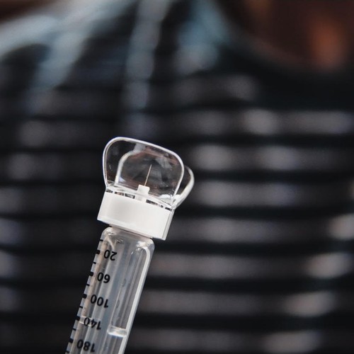
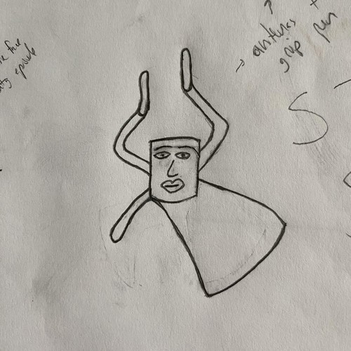
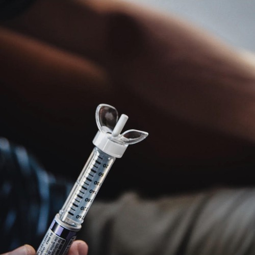
Steady Shot is an insulin injection aid that attaches to pen needles. Stabilizes the needle and makes it easier to rotate injection sites. (http://www.mysteadyshot.com)
Target market is diabetics. Appeal to moms of kids and kids but not cheesy and off putting to the adult male market. A 1980-1990's feel would be great.
Industry
Medical & Pharmaceutical


References
Other notes
Thank you for looking at this contest.
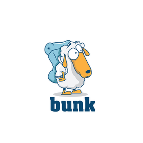
The Steady Shot character should look fun, inviting, geometric with a tad of asymmetry, and a bit goofy. Steady Shot is a weird character. It is a head with no body, with arms, and the U shaped legs that don't move. Steady Shot's arms are in position to grab the sides of the insulin pen with vertical palms (but there is no pen or needle in the logo just the Steady Shot character).
The Steady Shot character has asymmetry. One arm is higher than the other, left eye is very slightly higher than right eye, and left leg looks very small from that angle compared to his right leg.
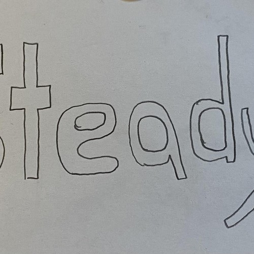
The Steady Shot text, the two t's in the logo. The first "t" is crossed lower than the second "t".
Contest deliverables
1 x Logo
Final files
If you use fonts that require a license, confirm with the client they're ok with it. For licensing reasons, it is better to provide your client with information on how to acquire the font rather than providing the actual files.
Text in logos should be converted to outlines.
vintage, inviting colors, good feeling and sharp design