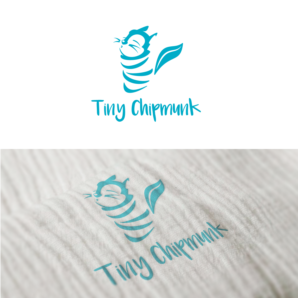
Logo for baby muslin swaddling garment

32
Created on 99designs by Vista
The main words that jumped out on the brief were, appealing, eye-catching and high-end.
I elected for a negative space logo as I felt this would give an interesting look to the folds of the muslin cloth, and would look nice once embroidered onto the final material.
I then went 'all out' on the cute aspect to make it instantly recognisable as a product aimed at the baby market, while trying to retain a classy look.
The next challenge was to make the face of the character sufficiently detailed but also simple so that it could still be recognised when scaled down.
I chose the colour so as to be gender neutral and therefore available to use on both boys' and girls' garments.