
Translated from french "The Beautiful People" The Beau Monde design is very much inspired by Latin/Greek classical architecture and sculpture and to some degree the renaissance. Most High end (not Nouveau rich) opt for the expensive look of traditional conceptual art.
Whenever I have worked with high-end clients I aimed to make their brands timeless, and iconic and priceless. Something you would remember seeing in a magazine or in a classy and upscale retail store. The detail is meant to reflect perfection and depth.
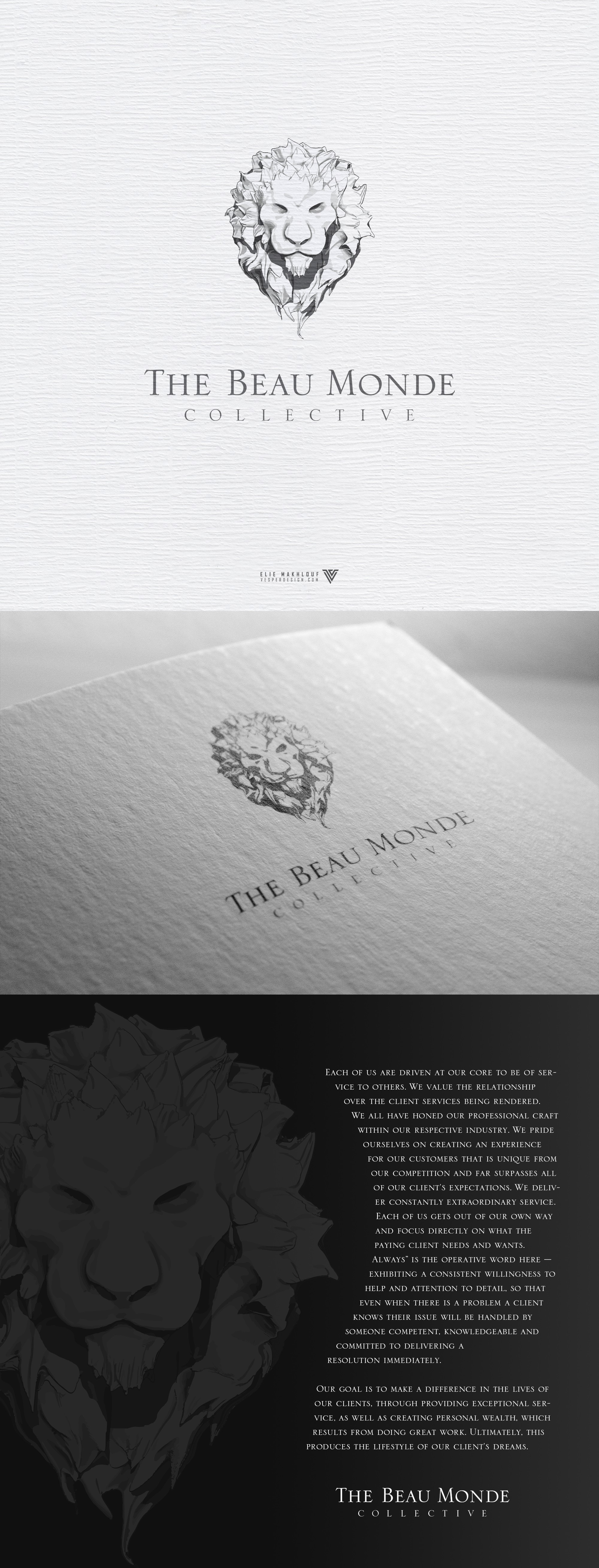
The design is hand-sketched and focuses on the light and dark aspects of sculpting. Capturing contrasts between light and shadow to create depth in the design. There are elements of watercolor just to offset the crisp lines that permeate the lion.
The Typeface is a classical take on a modern style and not meant to clash with the era of the icon but rather compliment the overall look by keeping it in the neoclassical era of Art.