
Created on 99designs by Vista
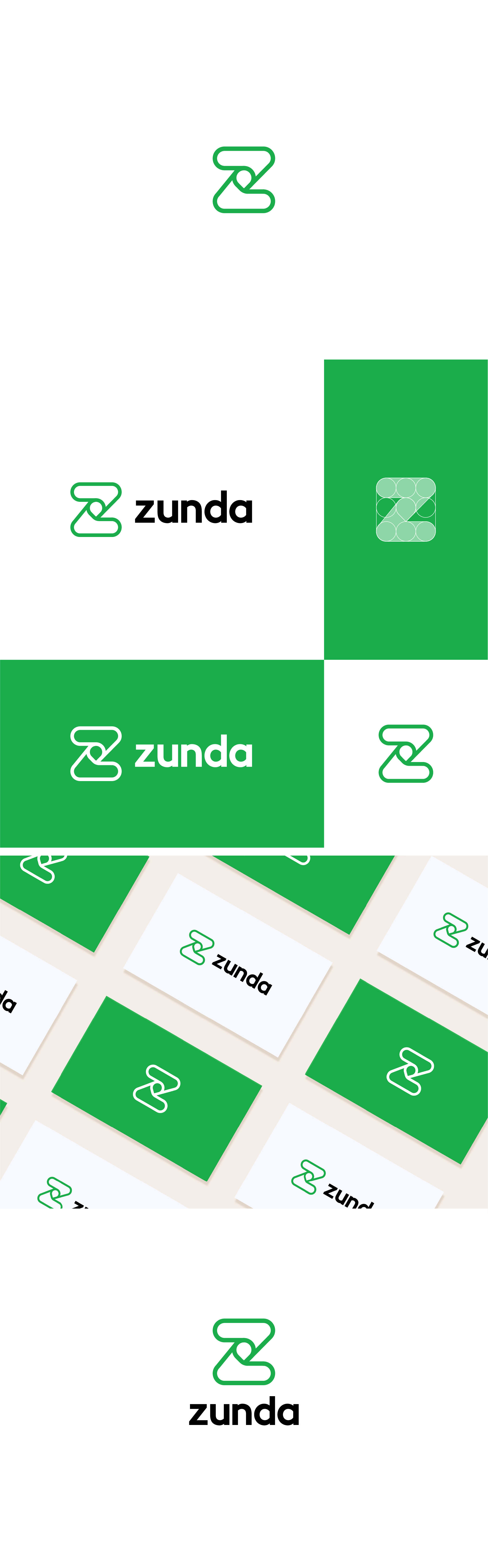
made more comprehensive and detailed thickness of the Z (yin-yang) logo icon such as a futuristic work table and Pin Location in the center. Kerning on the ZUNDA typeface to make it look balanced with a golden ratio. and I renew the solid green color to make it look more simple and easy to read and most importantly the logo is easily applied to branches in each country both vertically or horizontally.