Belgium Car Wash Business Card Concept

0
Created on 99designs by Vista
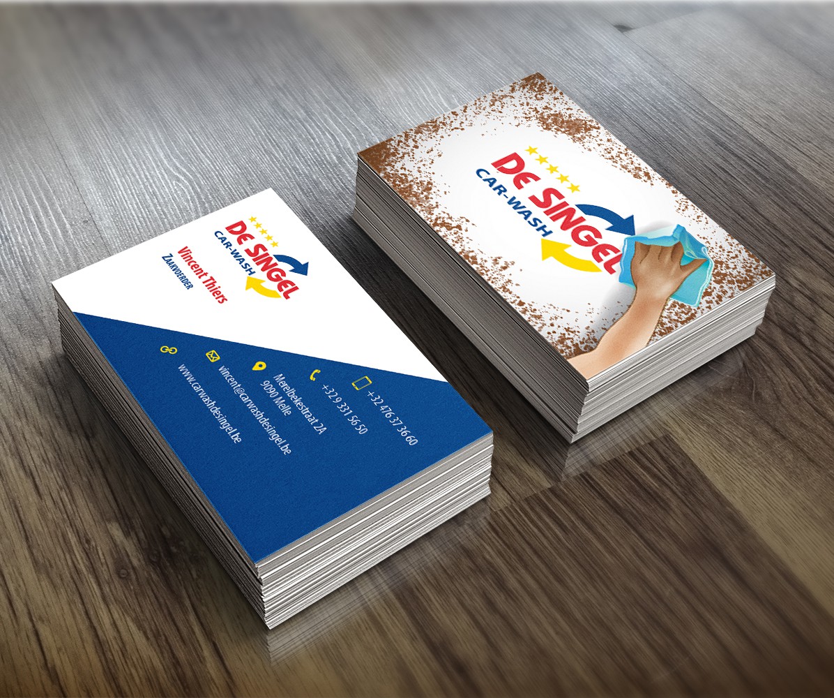
I first went to the current website and saw the look and feel of the site. Then I saw what the other designers have done and I wanted to do something completely different by adding a bit of depth to the design. I was looking for an element that shows the process of cleaning without being too complicated. When I found the wiping vector art (from Vecteezy.com) I knew that it was right for this client.
I added a bit more depth by layering the logo under the wiping hand so that it emphasizes the cleanliness of the logo and the brand itself.