Web designers had a great time last year with lots of new ideas setting sail. Although some sank, others took off and created a permanent impact.
The trends that made a big splash in 2013 will become house-hold names in 2014, while emerging web design trends continue to get polished and refined by designers everywhere.
>> Check out our newest web design trends here
So what web design trends lie before us in 2014? Let’s get started, and be sure to leave your thoughts in the comments.
1. Flat design thrives

Website: wistia.com
If you think this was just another fad, then you are mistaken. Flat design is minimalist design on steroids. It’s about keeping it simple, clean and modern which are words you often hear out of most clients’ mouths.
The reason why everybody is using flat design is because it makes sense. We have less clutter, more use of white space and overall a better user experience. It forces designers to achieve more by using less and for that, I consider it the number one trend for 2014.
2. Responsive design is a must

Website: KasraDesign
This will become a standard, no question about it. Clients will ask for it, developers will learn the coding requirements and then subsequently push for it. The reasoning is simple: demand. Since smartphones and tablets are selling like hotcakes there is huge marketing potential. You’ll see even your smallest business owner talking about it because they’re seeing responsive in action on other sites.
3. Websites showcase better images

Website: Portraits
Designers have been pushing for better images for a long time, yet they’ve always had trouble on the client side. 2014 will bring higher quality, more creative and unique images because of multiple reasons: pricing is affordable; loading speed is faster than ever; access to high quality images is everywhere.
4. Parallax websites grow in popularity
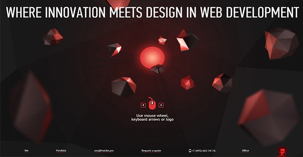
Website: Hot Dog
Long gone are the days of the 960 pixel website that had to work great on IE6. It’s all about the impact and making a BIG statement. Parallax design achieves that successfully with its scrolling mischief, powerful imagery, and strong and creative typography. You will see more and more of this in 2014 especially from big brands
5. Infographics remain the best way of representing data

Website: Gabriel Gianordoli
They present a lot of information in a small space, they’re eye-catching and they don’t cost the world. That’s why business owners are asking for them. The end-user likes infographics because each of them has its own personality — they’re a bit quirky, they combine typography, bold color schemes and shapes in a way that intrigues viewers.
Creatives who take them seriously always create a story atmosphere around their facts and numbers. Maybe it brings us back to our childhood comics, maybe it’s just the eye candy. Fact is, we’re absorbing loads of information and we love it. Because it’s such an effective way of communicating large pieces of data, it will definitely be used more and more in 2014.
6. Typography takes center stage
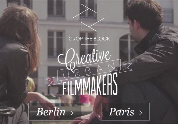
Website: Crop The Block
Goodbye Georgia, goodbye Times New Roman, goodbye Helvetica! Welcome to 2014 — the year where typography gets serious. Actually it was always serious, now it’s just arriving at mainstream status. The avalanche of mobile apps we’ve all been swimming in has exposed our eyes to all sorts of typography goodies and that has had a major factor in our font usage expectations.
Arial is no longer good enough because of the availability of high quality fonts at affordable prices. The user is accustomed to them to the point where he feels something is missing if he’s staring at the same ole’ Helvetica and on the other hand the business owner is no longer paying an arm and a leg for a complete font family.
7. Websites simplify and focus on content

Website: The New York Times
The New York Times recent redesigned website speaks volumes about this up and coming trend through it’s simpler, cleaner approach which aims to offer a far better user experience. While this isn’t anything new, I believe more and more websites, especially those that are content-heavy, will follow suit as this is the next logical step. Stripping away all the bells and whistles allows the actual content to shine and makes the design perform its actual role, instead of it trying to steal the spotlight.
8. Short presentation videos re-emerge

Website: Goldee
I think presentation videos will re-emerge in 2014 because of the Vine explosion. The six second videos are more likely to go viral, they’re easy to make and everybody seems to love them. In the last few years, we’ve seen a constant shortening of videos and this upcoming year will promote under 30 second clips to get the point across — you can thank Vine for that.
9. Newsletter designs continue to improve

Newsletter: Miniboden
Email marketing is no longer the only way to reach our audience, but it still is a medium that keeps your users interested in your content. In 2014, newsletters will stay afloat by being more creative and more exciting. So even though it’s not the preferred channel anymore, it’s not going to die anytime soon — smart business owners are recognizing the shift that’s happening.
10. Fixed navigations gets lots of love

Website: TheoryDesign
There was a time when designers felt the need to over-design just about anything on the page, including the main menu. Thankfully those times are gone, and we no longer need to look for a flash menu hidden under a ribbon somewhere on the side of the screen.
In 2014, navigation bars will be available at all times! So, if you’re dealing with a content heavy website, then a fixed position sidebar or top menu will be the logical approach.